Book of Days
BOOK OF DAYS: A POET AND NATURALIST TRIES TO FIND POETRY IN EVERY DAY
Sign up on the Contact Me page
Filtering by Tag: Middlebury
June 7: Catbird
Kristen Lindquist
Back in a dorm room--
catbird's song distracts me
from my memories.
June 6: Reunion
Kristen Lindquist
I'm at my Middlebury College reunion this weekend, in verdant, summery Vermont, tucked in the Champlain Valley between the Green Mountains and the Adirondacks.
The only thing unchanged
after 25 years--
this mountain view.
July 21: Characters
Kristen Lindquist
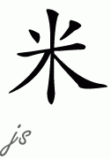
My alma mater Middlebury College posted a video today called Postcard from the Chinese School. In this short clip, various students at Middlebury's Chinese School respond to the question, "What is your favorite Chinese character?" (They reply in Chinese, of course, since all summer language students sign a "no English" agreement while they're there.) One young woman responded that she liked a particular character for the word "rice," "because when you write it, it's beautiful, like stars or fireworks."

I appreciated her aesthetic approach to her answer and, seeing the character, understand its appeal. It got me thinking about how we write our letters and which ones are my favorite. Back in second grade when we were learning cursive writing, I liked the capital Q best, because of its graceful curves and curls, like a big 2, a slender swan, or a curling wave rolling across the lines of the paper.

Also, that letter seemed the most unlike its non-cursive counterpart, thus perpetuating my belief that learning this new form of hand-writing was a bit like learning a secret code. (This was around the same time I began reading the Nancy Drew mystery series.) Also, Q in general is an unusual letter--a one-tile, 10-pointer in Scrabble--and it's part of my last name, Lindquist. I've always enjoyed having an odd letter in my name.
Of course we don't write in cursive anymore, so I never get to practice my flowing Q. It's probably just as well, because even my ordinary hand-writing has devolved over the years to near illegibility. But it fascinates me to think of the letters we write as characters like the Chinese symbol above, as little pictures--like the open mouth of O or the sinuous snake of S.
My friend Brian Willson, who designs fonts based on old handwriting, must think about this as he meticulously designs and creates a new font. He's not just drawing lines, he's creating a little piece of art for each letter. And I bet he has a favorite letter in each of his fonts, like the funky capital G in Texas Hero that looks like it would be fun to write but also looks a bit like a little sailboat heeled over in a strong wind or a long-petalled flower.
A was aleph was
once the shape of an ox head.
It still bears its horns.

